Portfolio:
Clients
Medical
- Advanstar Medical Economics
- American Hoechst
- B.Braun
- Contemporary Urology
- Davis & Geck
- EBI/Biomet
- Howmedica
- Johnson and Johnson
- Life Cell
- Merck
- National Geographic
- Rodale
- Schering
- Stryker Biotec
- Squibb
Children
- Albert Whitman
- Bob Jones University Press
- Book of the Month
- Candy Cane Press
- Crayola
- Chelsea House Publishers
- Cricket Books
- Golf Digest
- Hampton Brown
- Harcourt
- Highsmith
- Highlights
- Houghton Mifflin
- Inkwell Publishing
- Landau
- MacMillan-McGraw Hill
- Modern Curriculum Press
- Norfleet Press
- Pearson Learning
- Picture Me Books
- Ploughman Publishing
- Quarasan
- Random House
- Scholastic
- Scott Foresman
- Silver Burdett
- Sourcebooks, Inc.
- Spider Magazine
- Spirit Press
- Steck-Vaughn
- The Bradford Exchange
- Zaner Bloser
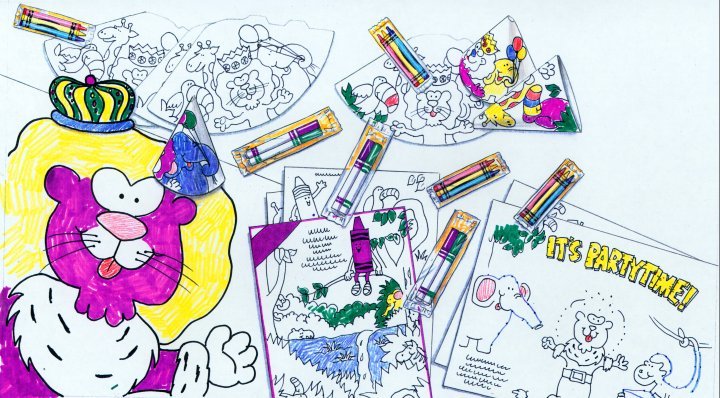
One of the tools of presentation that I inadvertently learned in advertising was the art of comp or concept boards. Much to my delight I was called upon to create a multitude of marker comps for all of my ads and campaigns. This was almost like a warm up exercise for me because the marker comps were looser than a finished illustration but I could render them quickly and realistically.
When I started my own business a large portion of my work was creating marker comps for ad agencies and companies such as Crayola. Through the years, presentations have turned more to computer compositions often using stock photos in place of marker renderings. I still believe that there is nothing like seeing a mounted ad campaign of marker comps filling a wall. There is an artistic flair and continuity that seems to be missing with just photos. Using the computer as a tool, I still start with marker drawings and then enhance them in Photoshop, yielding to progress but maintaining a crisp and engaging interpretation of the concept.
 Category:


